How to make payment wearable.
Simple processes and profitable partnerships: That's why wearonize is the leading partner for manufacturers and banks for wearable payment methods.


Our Challenges
Complexity simply wrapped
We had to create a complex but clear and simple to use product – with little to no references.
Make it clean
Through the coordination with several investors, not only the design, but the entire project had to follow a very clear line.
Combine & connect
What we always had to keep in mind: restrictions regarding bank security. Both the wearable and the app had to run effortlessly.
Outstandig but steady
We asked ourselves the question: How can we create a futuristic and unique look which is at the same time not overly outstanding?

Product Strategy
Payments with style and an authentic feel
UXi Package
To tell the wearonize story as authentic as possible, the first thing we did was create the wearonize UXi. We have set two goals from the beginning – one was to find the perfect stage for this new brand that hits the market. The other was to create an app and website that radiates trust, innovation, and intelligence. This is why we were involved in developing the wearonize branding from the start.

Product Design
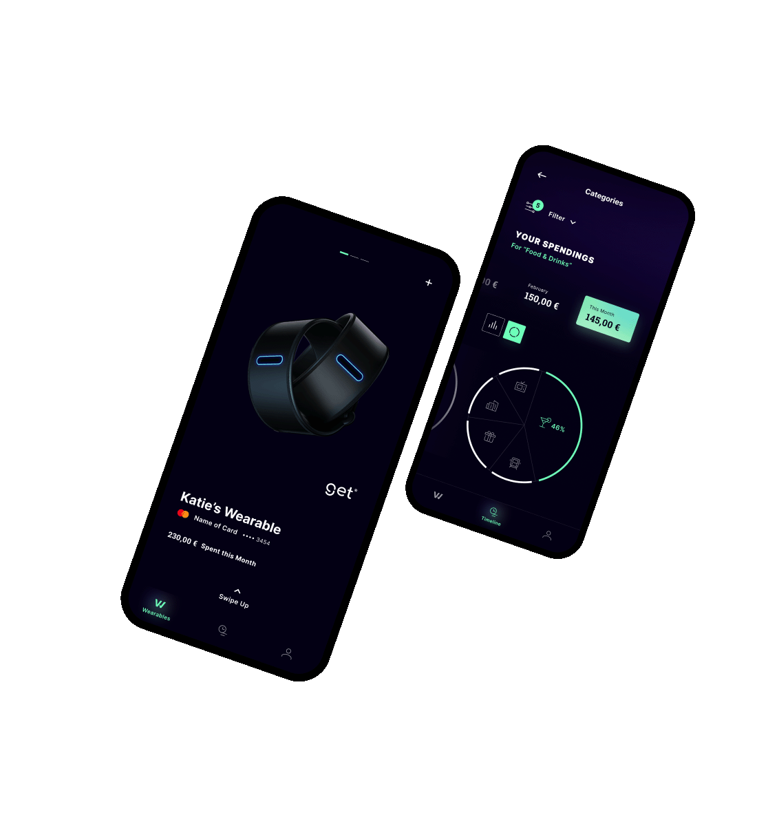
The future of payment is wrapped around your wrist
UX Design
The ongoing communication with the client has helped us to identify the essential features of the Wallet app – especially for the launch. With the pre-production of wireframes for almost all states and screens, we were able to give the client and investors a clear idea and direction of the future product. Building on that, we developed the UI design quickly and smoothly.

UI Design
The question was how to make this product stand out – following its set of brand values and identity, we wanted to make it unique, but still recognizable to the market. The answer was clear: a dark, futuristic, and technical design, in contrast to the bright and colorful world of wearable brands. Like a dark mirror, the design breaks up fine-line elements, perfectly implementing wearonize's brand values. The tech side of the product creates a sense of expertise that seamlessly transitions into soft and subtle gradients with focus. Visual wideness through white space, combined with reduced elements automatically guides the user's eye through the interface. A concise Active Color creates a clear and fresh focus that attracts attention.

Product Development
Paying attention to detail always pays off
Web Development
We had only two weeks to perfect the website – that means lots of adaptations and implementations to the most common breakpoints and everything in between. We made the individual sections directly accessible via the anchors inserted in the landing page link, as well as the navigation to the sections via the navigation bar. To make the information request as simple as possible, CTAs, which take the user to a pop-up window in their default email program, come with a pre-built subject line, content, and CC.

Payment like never before.
This resulted in a dynamic, slightly futuristic, but also very calm and clean design that makes operating your favorite wearables with just your smartphone effortless.


Heidrun Boeck
CMO | Wearonize AG