Learn how BMW turns complex data into insights
With more than €2 billion in business value created within BMW, the Cloud Data Hub becomes the central platform for data-driven decisions.
.png)

Our Challenges
Managing Complexity
Making the Data Portal experience enjoyable meant simplifying complex data without compromising accuracy.
A Diverse Audience
From inexperienced users to tech-savvy data scientists, we designed and built an experience that works well for everyone.
Mind the brand!
Who likes a faceless tool? Not us! That’s why we brought the Group’s brand character into the Data Portal with a brand-driven design.
What’s in a Name?
When you have different target audiences it’s so important to find common ground. And we did just that by making technical terminology accessible for all users.
Controlling the Domino Effect
Being on time is important, especially with multiple stakeholders and team members involved. You miss one deadline, everything slows down. To avoid this, we kept a close eye on estimates and target dates.
A Large Team
Bigger teams bring more opinions, which doesn't have to be a bad thing if you know how to collaborate. For this project, various teams from different companies and locations joined forces, and the result? Well, you can check for yourself!
Applied Services
UX Research
UXi - User Experience Identity
UX/UI Design
App & Web Development
Quality Assurance

Product strategy
Where data meets people
Qualitative research in practice
The Data Portal serves BMW Group employees around the world, so we set out to understand the needs of a large international audience. Our research team ran remote interviews with employees in Europe, China, and the USA, spanning a wide range of roles and technical expertise. We explored how they manage data day to day, how they experience the current portal, and where they see opportunities for improvement. These insights shaped clear recommendations for improving the portal’s concept and a set of design principles to guide its future design.

An empowering UXi strategy
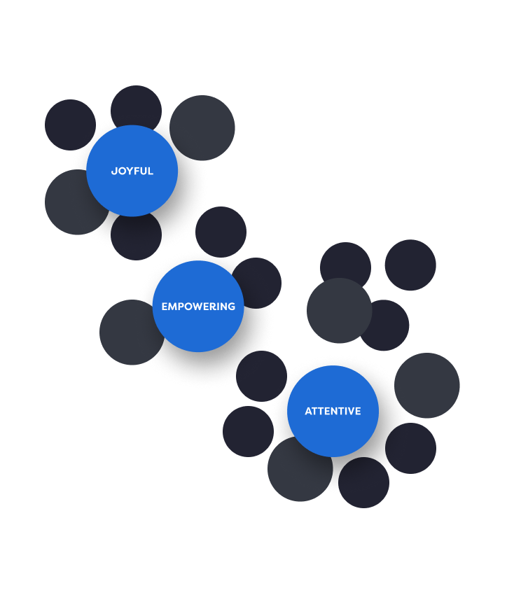
Thanks to our previous work with the BMW Group, we already had a User Experience Identity (UXi) in place. However, we refined it to define the core brand values as joyful, empowering, and attentive, with the Data Portal putting extra emphasis on the latter two. These values became our north star, helping our UX concepters and UX/UI designers shape both the structure and visual appearance of the platform.
Learn more about the related service


Product Design
Bringing insights to life and letting the brand shine
Interaction made easy
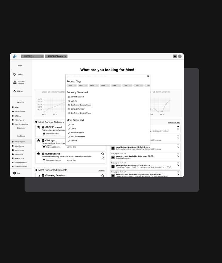
How to create an easy-to-understand, intuitively usable web platform for a truly diverse target audience? Easy, just ask our conception team – and they’ll tell you it was actually far from easy. The Data Portal quickly turned into one of the most challenging and exciting projects COBE has worked on, and it's mainly due to its complexity: understanding the full system and what was feasible proved to be a major challenge. On top of that, we were building on an existing design and concept. So, what was our secret sauce? Honestly, it all came down to intense collaboration in Figma and close communication with the client. That's what helped us answer open questions and remove barriers along the way.

Writing for users
As we mentioned, this is a professional data management platform, so a lot of the terminology is highly technical. Sure, there are experienced data managers using it, but there are also non-technical or less experienced users. Our goal, of course, was to have everyone understand the terminology and use the platform effortlessly. To achieve this, we paired technical terms with clear instructions and hands-on explanations. So far, users are loving it.
.avif)
Building a smart design system
A well-defined, smart design system and a clear tool setup are the foundation for any large-scale product design, and for the Data Portal redesign, they were essential.
With these in place, our design and development team brought the brand-driven redesign to life, making a highly technical platform more intuitive, efficient, and visually appealing, while ensuring consistency and scalability across the entire app.
Learn more about the related service
.png)

Product Development
Turning great into greatest
From design to code
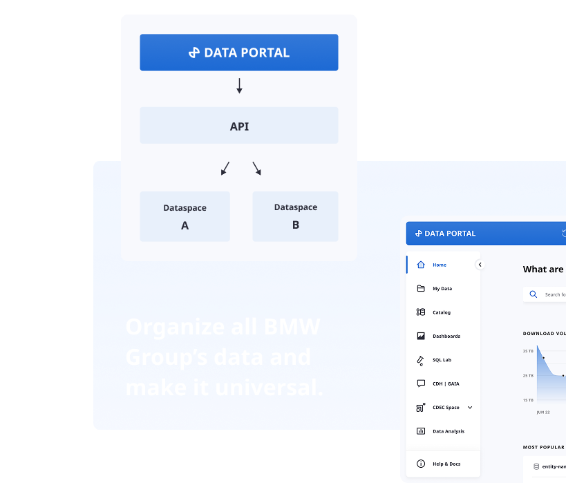
Bringing the Data Portal redesign to life meant diving into a feature-rich platform with a complex architecture — built by a 10+ person dev team in one shared codebase. While the codebase took time to get familiar with, many technologies were already known (React, Material UI, TypeScript, Jest/Enzyme). Others were new, especially AWS, the portal’s foundation.
Close collaboration with the client’s developers made all the difference: a dedicated onboarding developer in the first days, pair programming, and a warm welcome in the weekly tech sync made us quickly feel like part of the team.

Quality assurance at every step
Quality assurance was one of the most important steps in our project, knowing the platform is used across different countries and that people depend on it in their day-to-day work.
Here, collaborating closely with the whole team and following our quality assurance process was absolutely crucial – not only to manage the product's complexity but also to make sure we focused on the right testing priorities.
.png)


.jpg)


